 Inspiration
01Orange and peach
Warm orange tones represent fire and energy. Use soft peach or apricot on walls for a modern take that doesn't overwhelm.
Colour guidance from Vastu for the kitchen, and how to turn it into a modern colour scheme.
 Inspiration
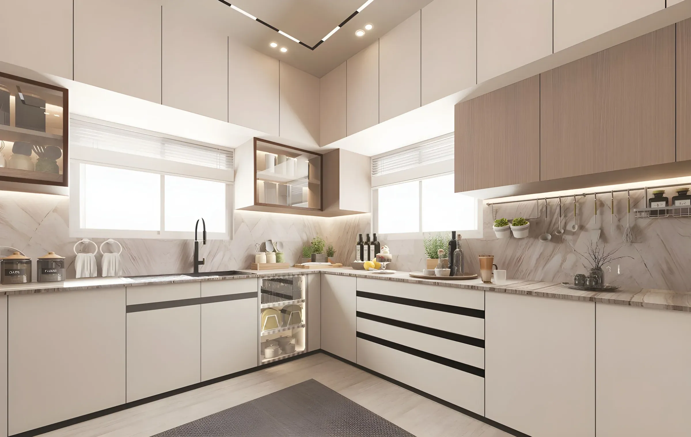
Choosing Vastu colours for the kitchen is a popular way to plan a kitchen's palette. Vastu links the kitchen with fire, so warm colours are traditionally recommended, especially for kitchens in the south-east. The good news: these colours also look great in modern modular kitchens.
Here are 12 commonly followed Vastu colour guidelines for the kitchen. These are traditional beliefs; use them as a starting point.
InspirationWarm orange tones represent fire and energy. Use soft peach or apricot on walls for a modern take that doesn't overwhelm.
 Inspiration
Red is linked to the fire element, but full red walls can feel heavy. Use it on a few cabinets or accessories instead.
Yellow is considered auspicious and makes kitchens feel cheerful and bright. Butter or mustard both work.
 Inspiration
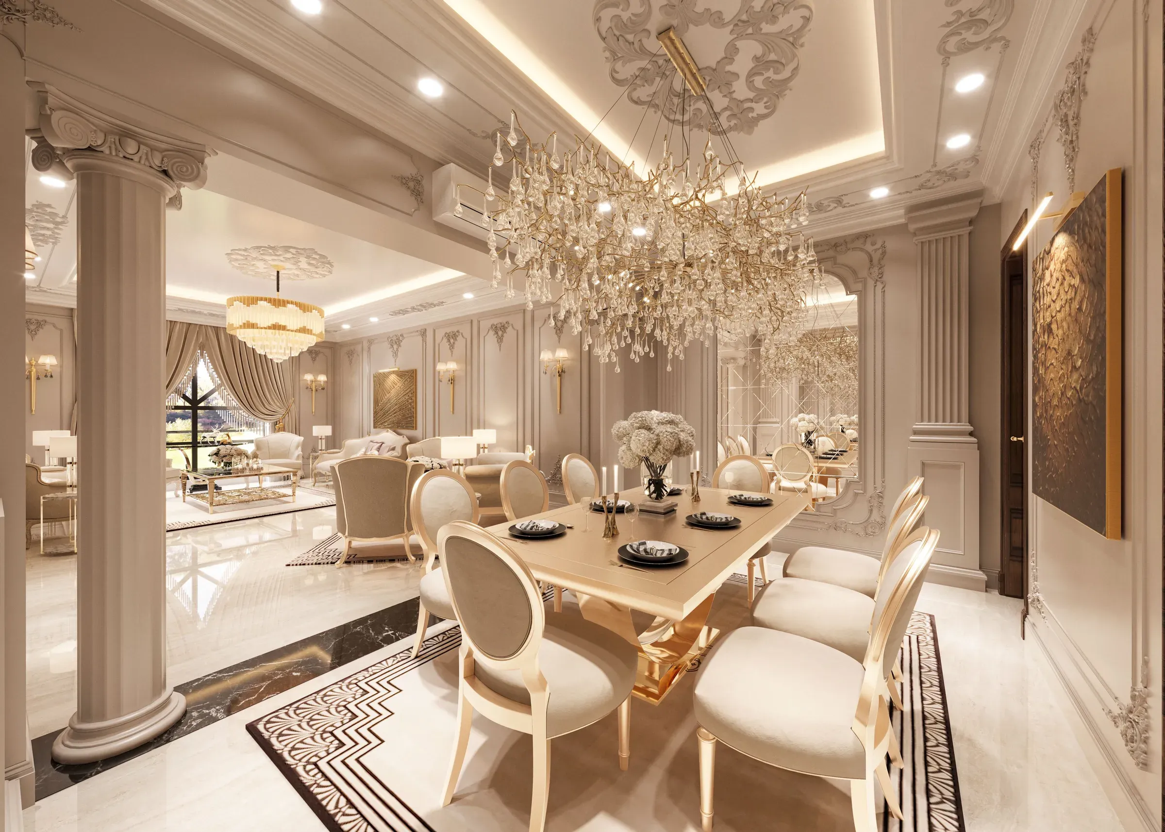
Neutral and calm, cream suits any direction and keeps the kitchen light.
Green is linked to growth and suits kitchens facing north or east. Sage or olive cabinets look modern.
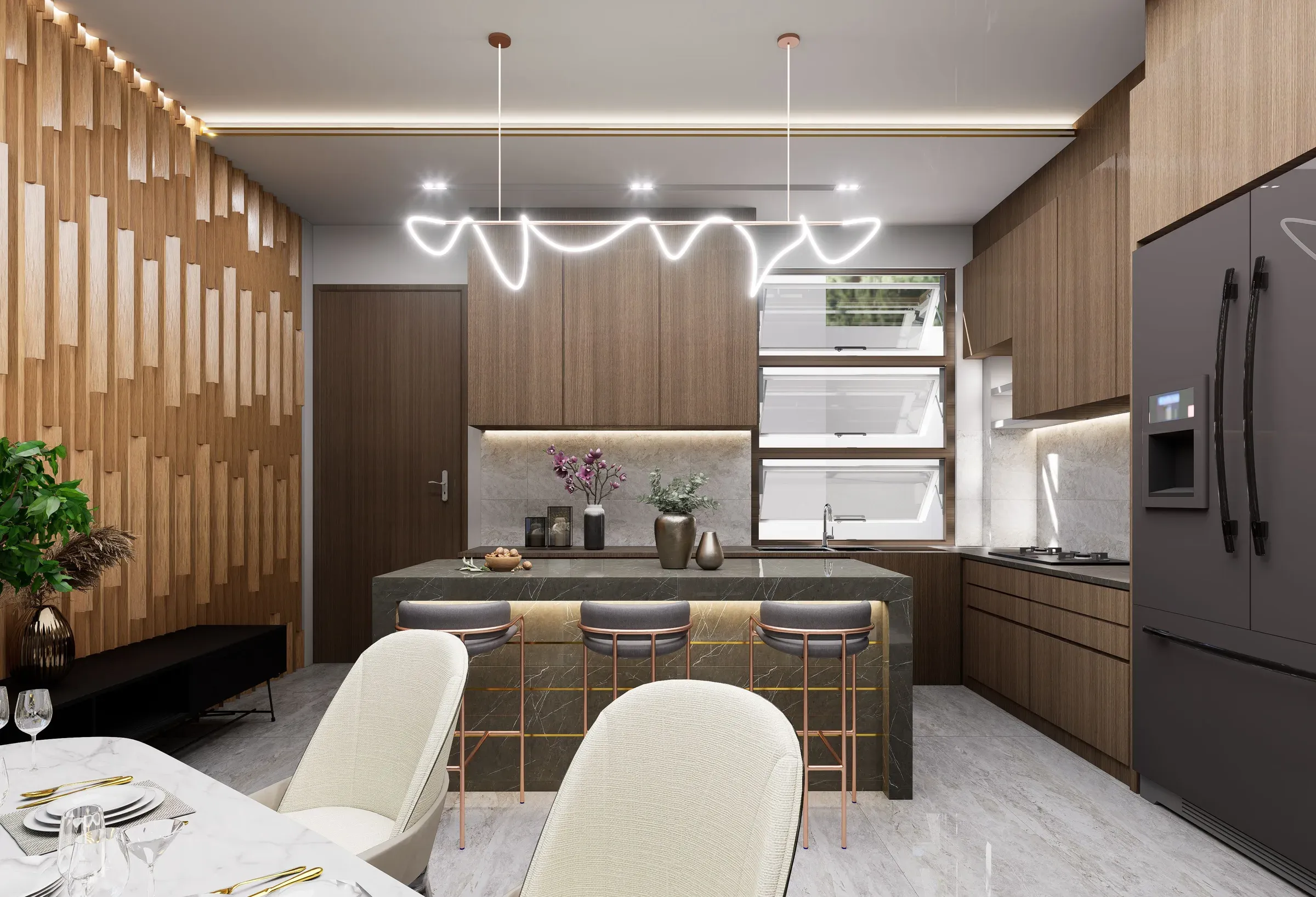
Earthy browns bring stability; wood-grain laminates fit this easily.
For south-east kitchens, orange, red, pink and yellow tones are traditionally preferred.
Brown, green, yellow or black granite are commonly suggested for the slab; many families avoid pure white near the stove.
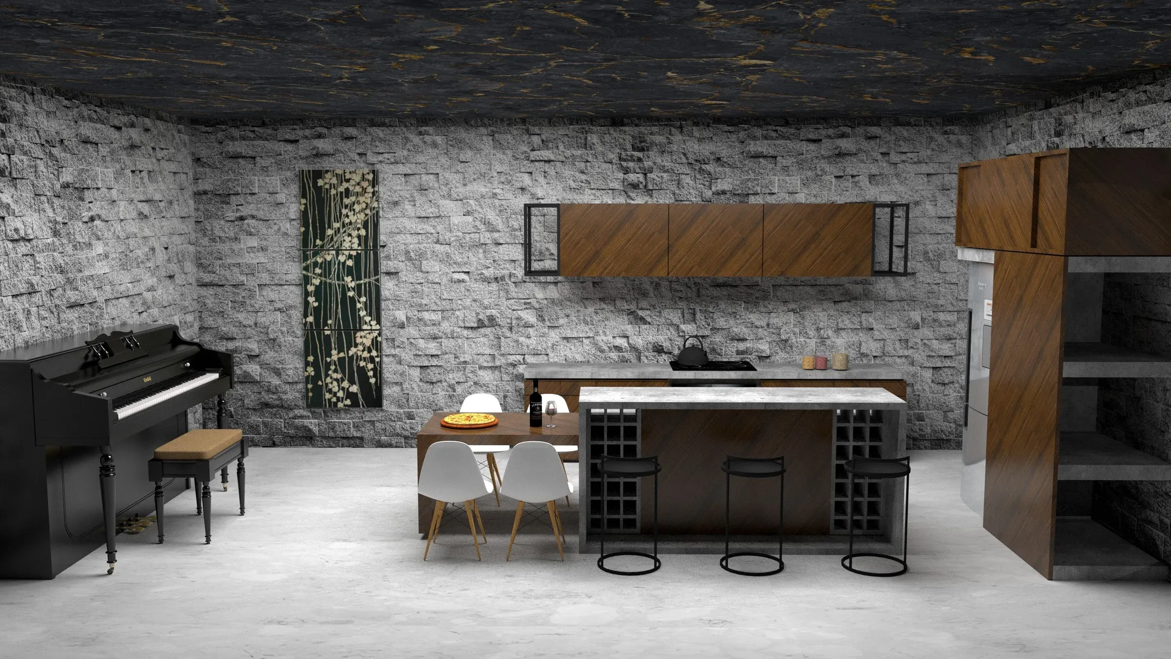
Large areas of black are usually avoided on walls; use black only as an accent or on the counter.
 Inspiration
Blue represents water and is often avoided near the stove. Light blue in small doses is acceptable to many.
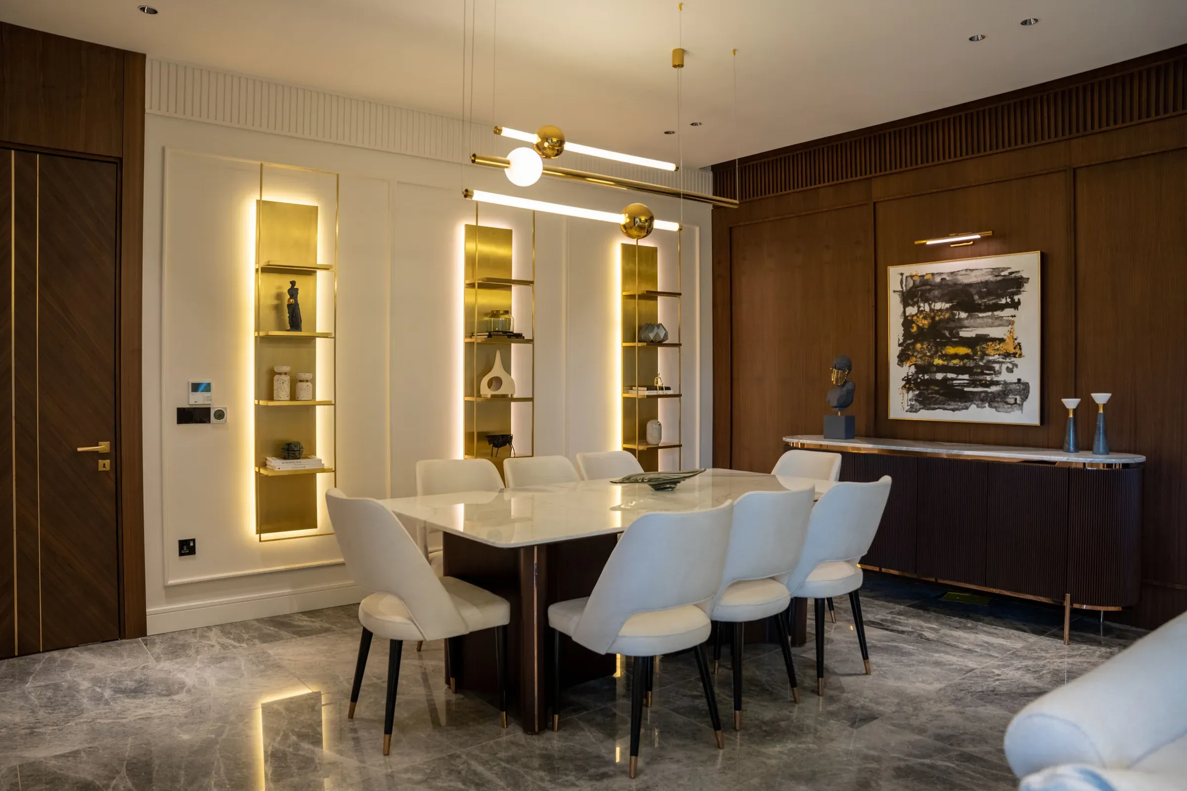
Combine cream uppers with warm wood or peach lowers.
A well-lit kitchen is a key Vastu principle. Good lighting makes any colour look its best.
Want a kitchen colour scheme that follows Vastu and looks modern? Our modular kitchen in Kolkata service can show you options in 3D.
FAQs
Warm colours like orange, peach, yellow, red accents and cream are traditionally preferred.
Orange, red, pink and yellow tones, used softly.
Brown, green, yellow or black granite are commonly suggested; many avoid white near the stove.
Large areas of black and dark blue are usually avoided.
Ready to plan your home?
Book a free consultation with a designer. No obligation, no pressure.